
Overview
Most barbershop websites look the same: before-and-after photos, star-rating badges, and a loud booking button. Ricalsso opened as a premium shop and needed to feel like a destination, somewhere a man goes for an experience as much as a haircut, not a place that competes on discounts.
The challenge was to create a brand that was memorable before anyone had walked in, and to treat booking quietly, as something that happens naturally once the visitor is convinced, not something pushed at them.
Solution
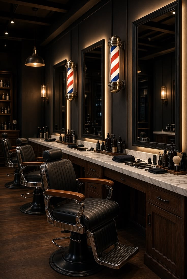
The direction centers on a figure named Ricalsso whose face is never shown. The site reveals only fragments: a jaw lit in amber, an eye in shadow, a hand on a razor. The mood draws on 1920s gentleman's clubs and film noir, with a near-black background, antique gold accents, and leather tones, elegant serif headlines, and subtle film grain.
Booking stays deliberately quiet, available in the footer and through one understated call to action. There are no rounded buttons, bright colors, or rating badges. The goal is for the visitor to feel they have found something hidden.
Process
We started with the owners and the story they wanted to tell, then defined the concept and the visual rules before designing any pages: what appears, what never appears, and how booking is handled.
The design direction is presented for approval before the full site is built, following the standard Jublr process.


Final Thoughts
Ricalsso's website is currently in development. This project shows the brand direction we created for it: a barbershop identity built on mystery and restraint, designed to stand apart from every other shop in the area.
